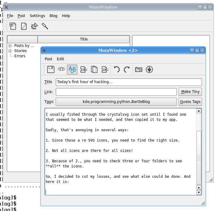
Today's first hour of hacking...
... has been all about UI.
I have always had a problem when writing PyQt apps: stock icons.
Which ones should I use? Where are they?
I usually fished through the crystalsvg icon set until I found one that seemed to be what I needed, and then copied it to my app.
Sadly, that's annoying in several ways:
Since those are PNG icons, you need to find the right size.
Not all icons are there for all sizes!
Because of 2, I need to check three or four folders to see all the icons.
So, I decided to cut my losses, and see what else could be done. And here it is:

I am now using all SVG icons, from the reinhardt set that will look equally out of place in all OSs, but which I like (and I think look awesome with this relaxed Domino theme). And because they are all SVG, I don't care about sizes, and they are all in the same place, and all is good.
And whenever Oxygen is released, all I need to do is switch the files around and that's that. Which is nice, too.
Of course there is a catch... it does look out of place, and I expect many to find it ugly. So what, since I am the only user of this app! ;-)
I've always been a huge fan of Reinhardt. In fact, much of Lenir's stuff rocks!
Maybe you are already set on your iconset choice, but you could also check out Monochrome and Primary (they are also fully SVG):
http://www.kde-look.org/con...
http://www.kde-look.org/con...
I prefer them, but i'm a bit biased ;D
Danny
Danny: Very nice! Primary in particular.
Why not use Gtk's built in standard icon naming scheme so that the application loads whatever icon set the user is using on his desktop?
Looking at that toolbar it appears that those are quite common icons too...
Kevin: because this is not Gtk.