rst2pdf: smartframes branch
Today I started a branch called SmartFrames. The main goal is to achieve a better text flow in the document (for example, for sidebars), and it is starting to get there, slowly.
Let's consider how ReST sidebars are rendered in the different writers.
We'll work with an ordinary lorem ipsum that has a sidebar declared just before it.
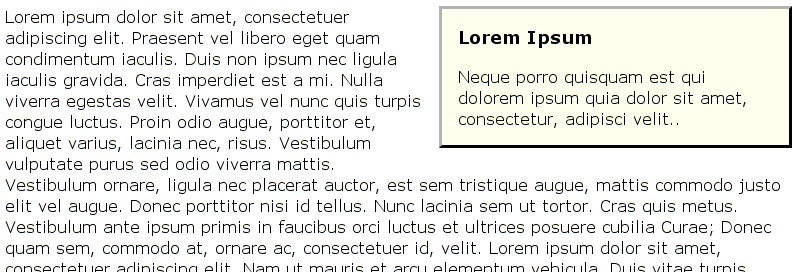
Here's HTML:

And here's LaTeX:

Each one has its good side and its bad side.
The HTML sidebar is a real sidebar, while the LaTex one is some sort of insert.
OTOH, the ragged text against the HTML sidebar is ... horrid.
So, I wanted something at least a bit better than that for rst2pdf. In the best of all possible worlds, it would be the neat text alignment of LaTex with the floating HTML sidebar.
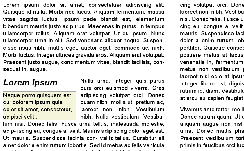
Here's how it looks now:

There are some minor problems with the current implementation, such that the sidebar is always aligned to the top of a paragraph, and some spacing issues.
How is it done? Let me tell you: it was not trivial :-)
In fact it's pretty evil, but here's a quick explanation:
When I get a sidebar flowable, I insert a new frame in the page template where the sidebar should go, then call a framebreak, insert the "real" sidebar, a "framecutter" and another framebreak.
The framecutter is a flowable that does nothing visible, but inserts another two frames, one at the right of the sidebar with the same height, and another below the sidebar, full width.
I need to use the framecutter because I don't know the height of the sidebar until after it's drawn.
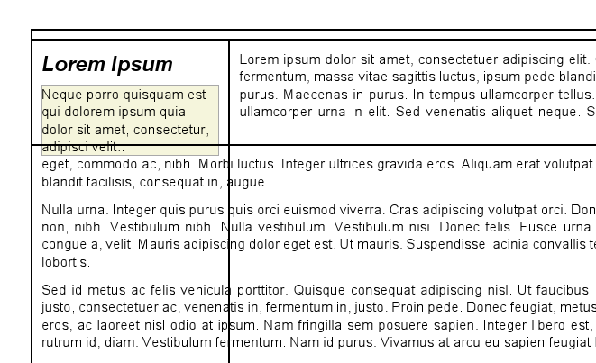
So, we now have 4 frames instead of one:
The original frame, covers the whole page, but has a framebreak above the sidebar.
The sidebar frame, which is very tall, but has a framebreak below the sidebar text.
A beside-the-sidebar frame, short and wide, starting at the right of the sidebar.
A below-the-sidebar frame, wide and tall, starting below the sidebar.
The text should flow from 1 to 3 to 4 neatly and the seams shouldn't show.
Here's a picture that MAY make it clear (there are some odd displacements: those were bugs):

So, I'm not calling it a success yet, but it is looking decent.