Weirdest KDE appearance in the news yet is....
... asking the president of Kazakhstan how to patch it under FreeBSD (which I must confess I have no idea, unless you answer "using patch"?).
More info here.
... asking the president of Kazakhstan how to patch it under FreeBSD (which I must confess I have no idea, unless you answer "using patch"?).
More info here.
Kmail searches slowly.
I have been a kmail user for a couple of years, since I settled in my own home office with my own computer.
I like the thing.
However, it annoys me that it takes sooooo long to find a message in my mailstore. Hey, it's only 13000 messages!
So, while I wait for KDE4 to bring all its searching goodness, I decided to see if I could hack something quickly.
Enter mairix: a mail indexer/search thing.
Convincing mairix to index all my mail was rather simple (here is my ~/.mairixrc):
base=/home/ralsina/
maildir=Mail/*...
maildir=.kde/share/apps/kmail/dimap...
omit=Mail/mairix
database=~/.mairix_db
What does it do?
It indexes mail stored at ~/Mail and everywhere in my kmail imap folders.
It stores search results in ~/Mail/mairix and ignores its contents when searching. The results are stored as links, so they waste no disk space.
After running mairix so it builds its DB (took about a minute, which is less than most kmail searches) , you can search for things like this:
[ralsina@monty ~]$ time mairix b:bartleblog
Matched 6 messages

real    0m0.232s
user    0m0.012s
sys     0m0.204s
And the result can be seen in kmail, in the mairix folder:

However, there is a problem. It will work for the first search, but not for the second one. On the second search, you get the same content listing, but all messages appear empty.
That's because kmail saves an index file of each folder. To work around that, I wrote a little shell wrapper, kmairix:
#!/bin/sh
rm ~/Mail/.mairix* -f
mairix $*
And you use that instead of calling mairix directly.
But there are still improvements to be done. If your kmail is currently displaying the mairix folder, searching doesn't update the message list.
DCOP to the rescue! We can switch to the inbox, then back to mairix (adjust as needed for yourself):
dcop kmail KMailIface selectFolder /Local/inbox
dcop kmail KMailIface selectFolder /Local/mairix
Missing pieces:
How about switching to the kmail window? Sadly, the kwin DCOP interface seems incomplete. Maybe assigning kmail a hotkey and work from there? Let me know if you have any ideas.
UPDATE as suggested by Anno Heimburg: just call kmail.
A GUI (of course!) probably with a tray icon...
A way to auto-update the Mairix DB when new mail arrives. I am thinking about doing it with incron but have not done it yet.
So, here is the final version, put it somewhere in your path, and use ALT+F2 to search your mails :-)
#!/bin/sh
rm ~/Mail/.mairix* -f
mairix $*
dcop kmail KMailIface selectFolder /Local/inbox
dcop kmail KMailIface selectFolder /Local/mairix
kmail
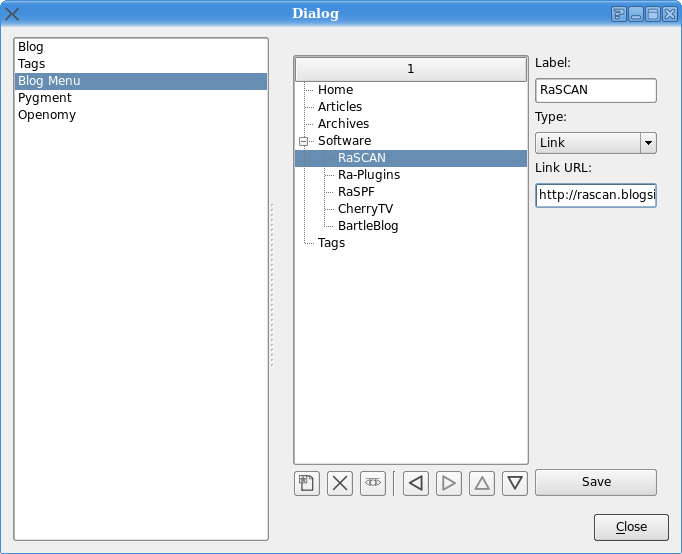
Took a while to implement, but BartleBlog finally got a functional menu editor:

Right now, it only works with the mootools-based menu gadget, but I will start working on the yahoo menu version in a moment.
The only thing not working is the preview button, because it needs more support on the backend side.
... has been all about UI.
I have always had a problem when writing PyQt apps: stock icons.
Which ones should I use? Where are they?
I usually fished through the crystalsvg icon set until I found one that seemed to be what I needed, and then copied it to my app.
Sadly, that's annoying in several ways:
Since those are PNG icons, you need to find the right size.
Not all icons are there for all sizes!
Because of 2, I need to check three or four folders to see all the icons.
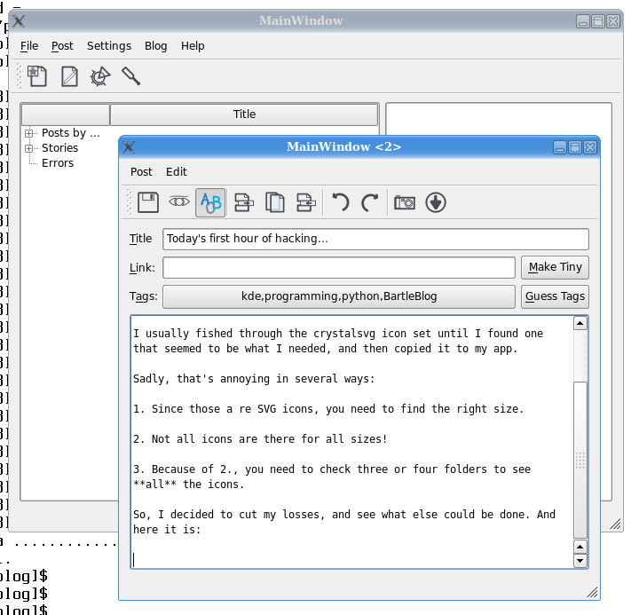
So, I decided to cut my losses, and see what else could be done. And here it is:

I am now using all SVG icons, from the reinhardt set that will look equally out of place in all OSs, but which I like (and I think look awesome with this relaxed Domino theme). And because they are all SVG, I don't care about sizes, and they are all in the same place, and all is good.
And whenever Oxygen is released, all I need to do is switch the files around and that's that. Which is nice, too.
Of course there is a catch... it does look out of place, and I expect many to find it ugly. So what, since I am the only user of this app! ;-)
Done with the main blog config dialog.
Fixed a dozen bugs
Generate the blog in a reasonable place
Fixed a lot of UI bugs (tab orders, sizes)
Still lots and lots of things to be done, tho.